Maybe the problem lies in the way so much of America is pop culture. They way everyone wants the new thing or the new fashion. Put simply, America is too flashy. There, I said it. Look at the Oregon Ducks and the 1,000 different combinations of helmets, jerseys and pants they have. The University of Oregon is the USA of college football. The have a logo that they use and that is the only thing that is consistent. That and the fact that there uniforms are consistently different.
Let's run down a list.
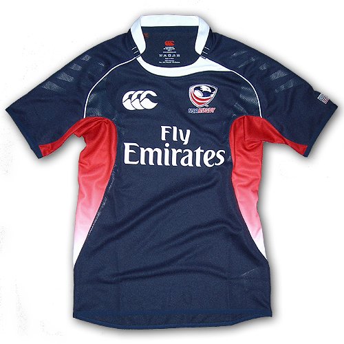
Rugby
Baseball
Basketball
Soccer
In my opinion all terrible uniforms. The one major sport with good uniforms? Hockey. Consistent. Whiter shirt, blue shoulders, red and blue stripes at the bottom and USA across the front.
Compare 1980 to 2010:
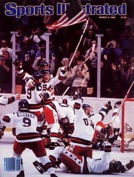 |
| 1980 Winter Olympics |
 | |||
| 2010 Winter Olympics |

I don't love the need to make a logo out of USA.... I mean this one looks better than the Baseball team's attempt, but come on. I just find these logos to be so cheesy. It's tacky. It's awful. Basketball actually isn't that bad, now that they have moved on from the Dream Team's cheesy USA Basketball logo. In Soccer and Rugby we just don't have an identity. I understand subtle changes that may occur, but this is ridiculous. You can see some of the progression of the USA's rugby kit on RugbyMag's website.
Someone suggested going with a look like the Cal Golden Bears. Blue socks, white shorts and thin red, white and blue hoops. I actually really like this idea. It gets all the colors in, isn't overly cheesy. While hoops, may not be a classic look for the Eagles, I really think it could work. Here is an example of what the Cal uniforms look like.

It looks good, kinda classic. Cal is the pinnacle of collegiate rugby in the USA. So, really it could work. Not sure about how Cal fans would feel to have their color scheme applied to the national team, and also, not sure how Cal haters would feel about it. But I do like the kit used lately, including for the match vs the England Saxons.
The USA needs to pick an identity and go with it. We can't be changing every single year.
No comments:
Post a Comment